Changes that Continue Traditional Values
Hanil Holdings corporate identity symbolizes the company’s role as the foundation of the national infrastructure industry and national economic growth.
Hanil Holdings corporate identity symbolizes the company’s role as the foundation of the national infrastructure industry and national economic growth.
Symbol Mark

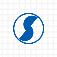
The symbol mark of Hanil Holdings is an abstraction of the Korean territory, demonstrating the company’s goal to distribute its products to every corner of the country, contribute to the national economic growth, and thereby achieve sustained and robust growth into the future. The size of the symbol mark may not exceed 4cm in diameter, and mainly applied to web templates, mobile web pages, printouts, and other related documents.
Color System
a. Basic Color ‘Hanil Blue’
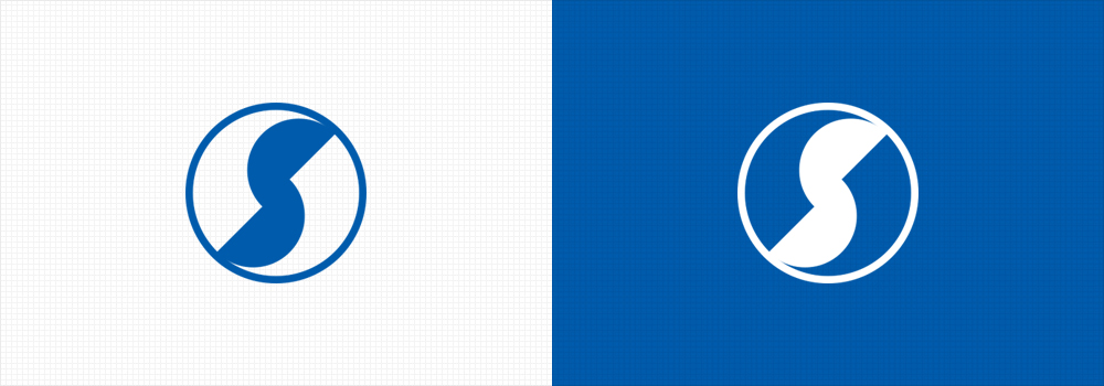
The Basic Color for the Symbol Mark is Hail Blue (HL Blue: DIC 2597).
However, the user may apply the colors flexibly within a tolerated range, as demonstrated in the samples, based on the features of the medium in which the symbol mark is used.
On printouts whose colors are generated by the four primary colors, utilize “process colors” indicated in e. Printout Color Regulation.
b. Gold

c. Silver

d. Black

e. Printout Color
Cyan 100% + Magenta 60%
Type
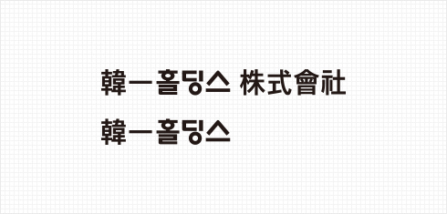
a. Korean
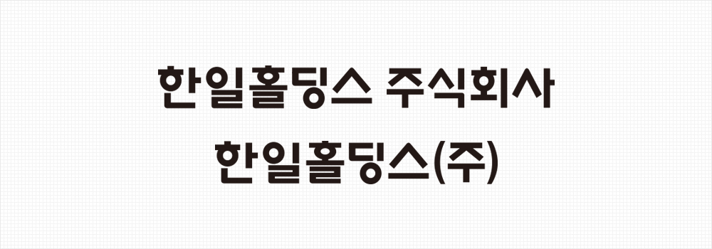
The font in the symbol mark was designed to look sophisticated, but also appear clean-cut and simple. Korean is the preferred language for the CI, but English or Chinese versions may be used in special circumstances or for use in overseas locations.
b. English
c. Chinese Character